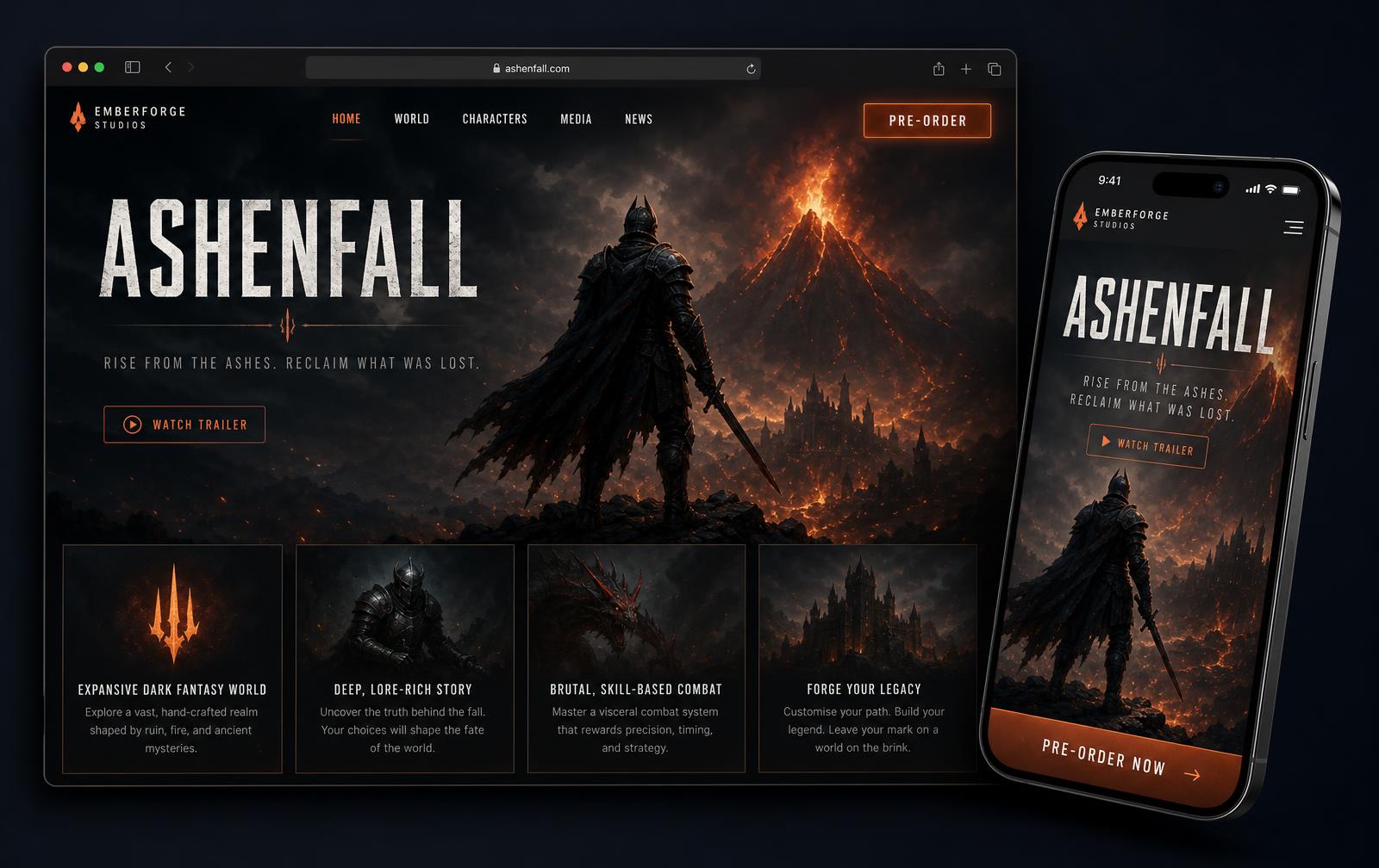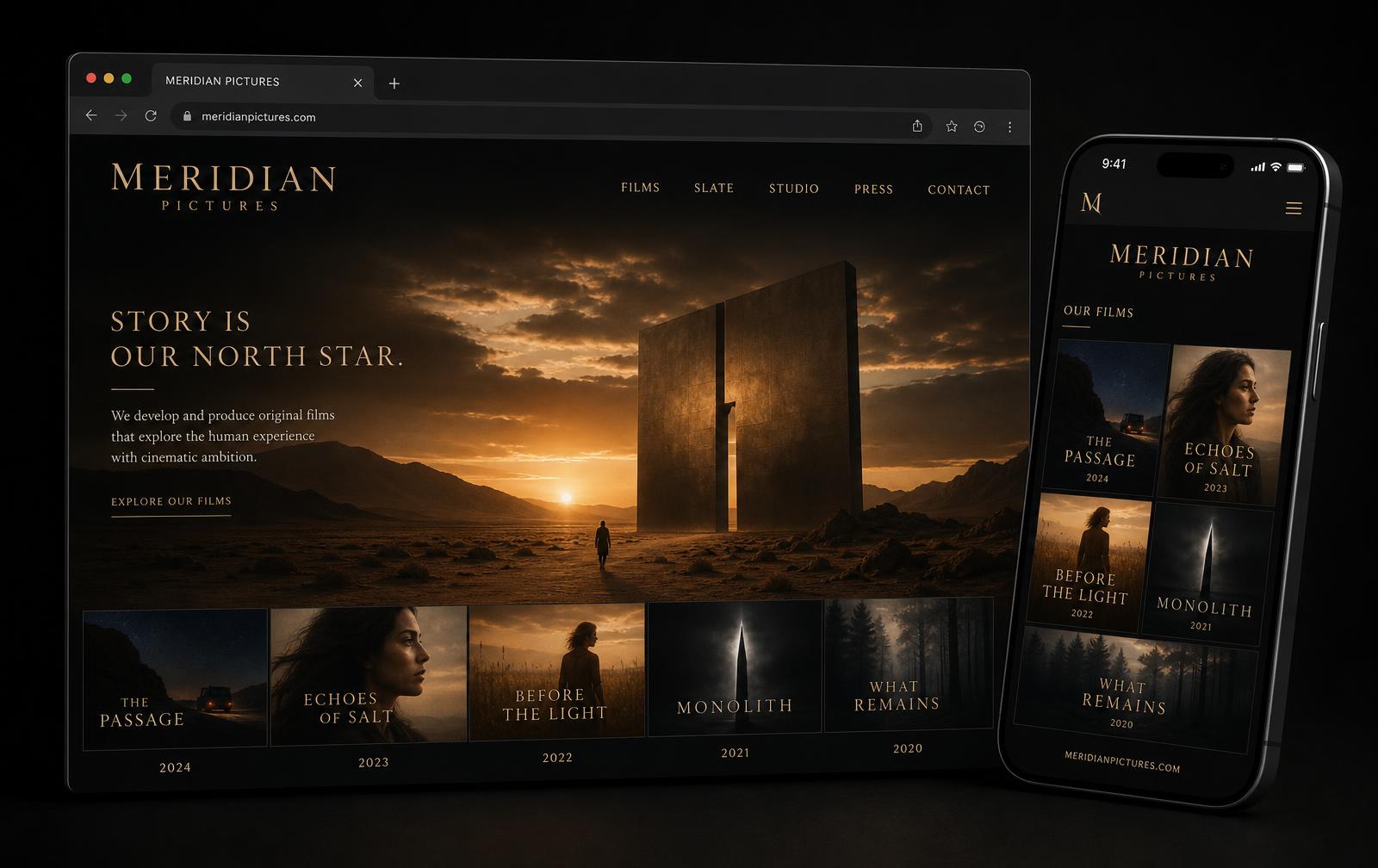
Gallery
01Fintech / SaaS
Novafin
A treasury dashboard built for clarity under pressure.
Concept — CIRIUSSOFT studio work · fictional brand
Open live demo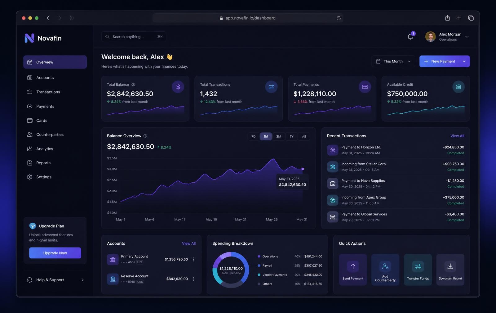
The brief
Financial products fail on comprehension, not features. Operators need balances, movement and exceptions readable in seconds, on a screen they stare at all day, without the interface shouting.
How we'd approach it
- Information hierarchy first — four primary metrics, then movement, then detail.
- A dark, low-fatigue surface with a single accent gradient reserved for actionable elements.
- Charts drawn to the same grid as the cards so scanning stays effortless.
- Trust cues — audit trails, statuses, permissions — treated as part of the design system.
Key screens
Overview
Balances, movement, spend breakdown and quick actions.
Transactions
Filterable ledger with statuses and bulk actions.
Payments
Multi-step approval flow with permission gates.
Palette
Base
Surface
Violet
Cyan
Positive
Typography
- Display
- Geometric sans, tight tracking
- Data
- Tabular numerals, monospaced
- Body
- Neutral sans, 15/24
Build
ReactTypeScriptTanStackPostgresChartingDesign tokens
What ships
- — Component library covering 40+ product states
- — Accessible contrast across the full dark theme
- — Sub-second perceived load on the dashboard shell